Colour
Differentiate floors, zones and destinations with a palette that belongs to the architecture.

COLOUR-LED INTUITIVE WAYFINDING
We use colour, geometric form, typography and landmarks to make public-facing environments clearer, more welcoming and more memorable.
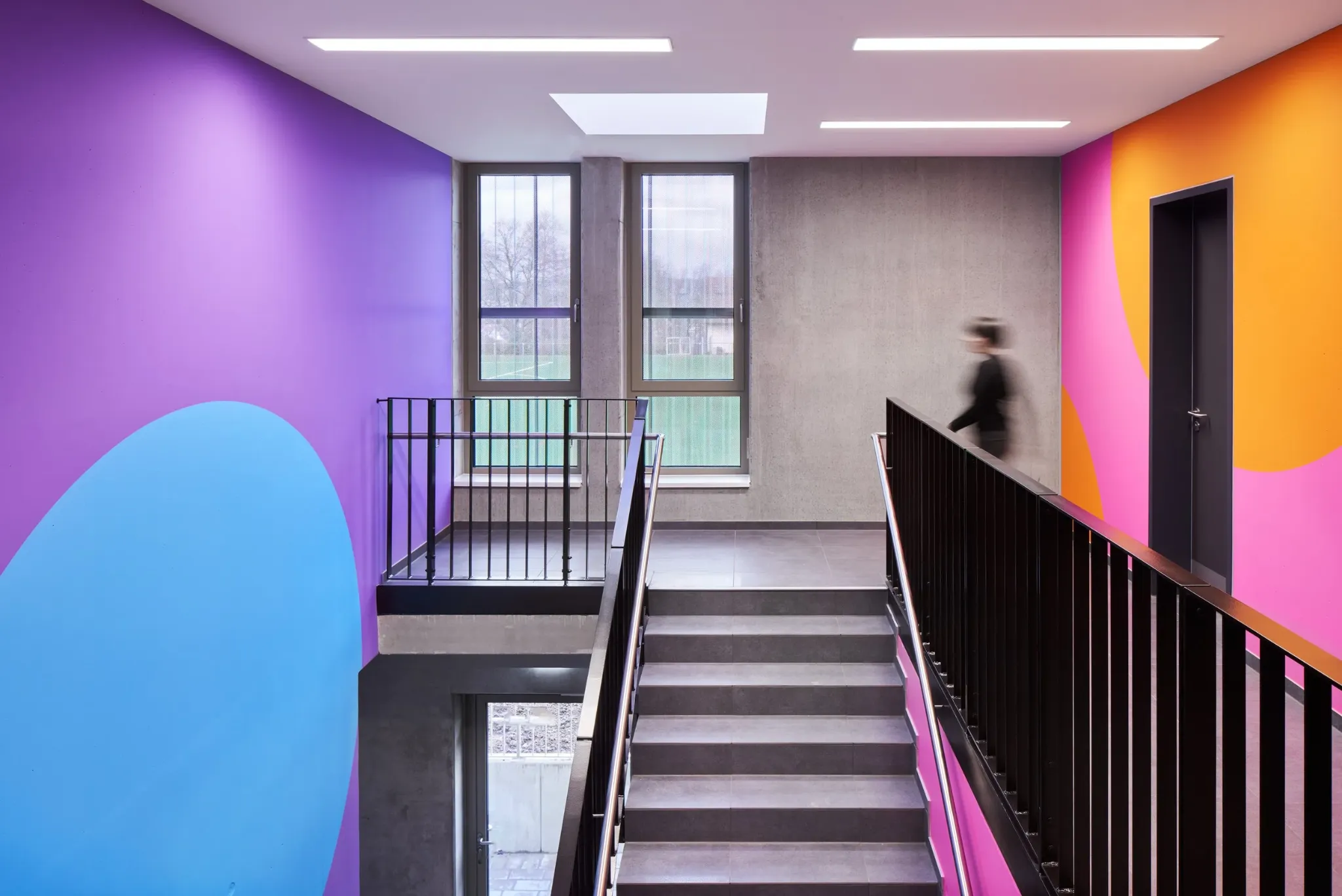
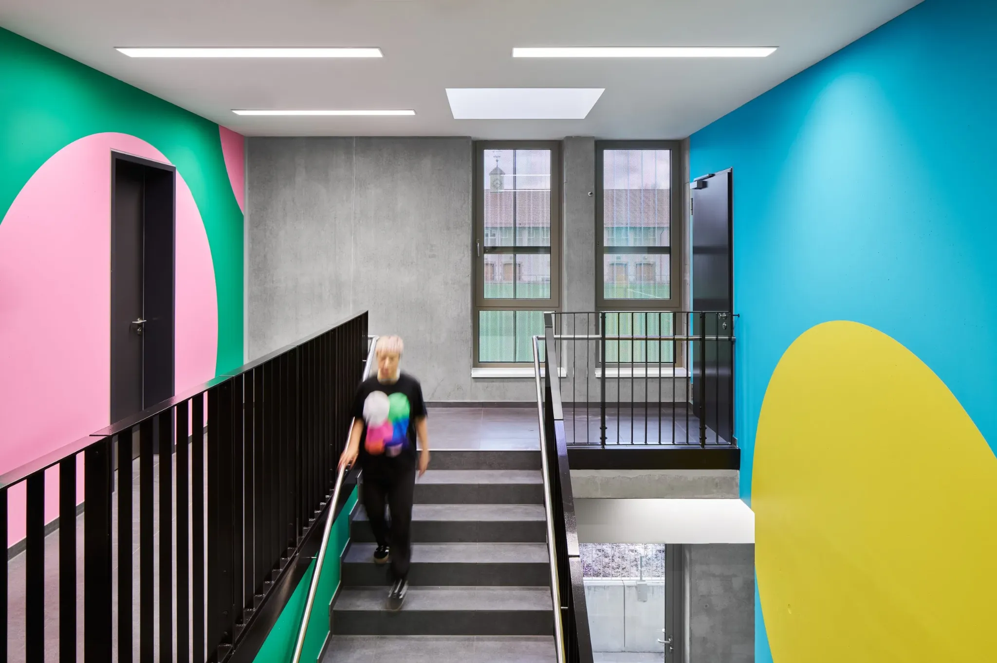
Colour and geometric form can create recognisable cues, zones and landmarks throughout a building — helping people orient themselves without relying entirely on written signage.
ABOUT US
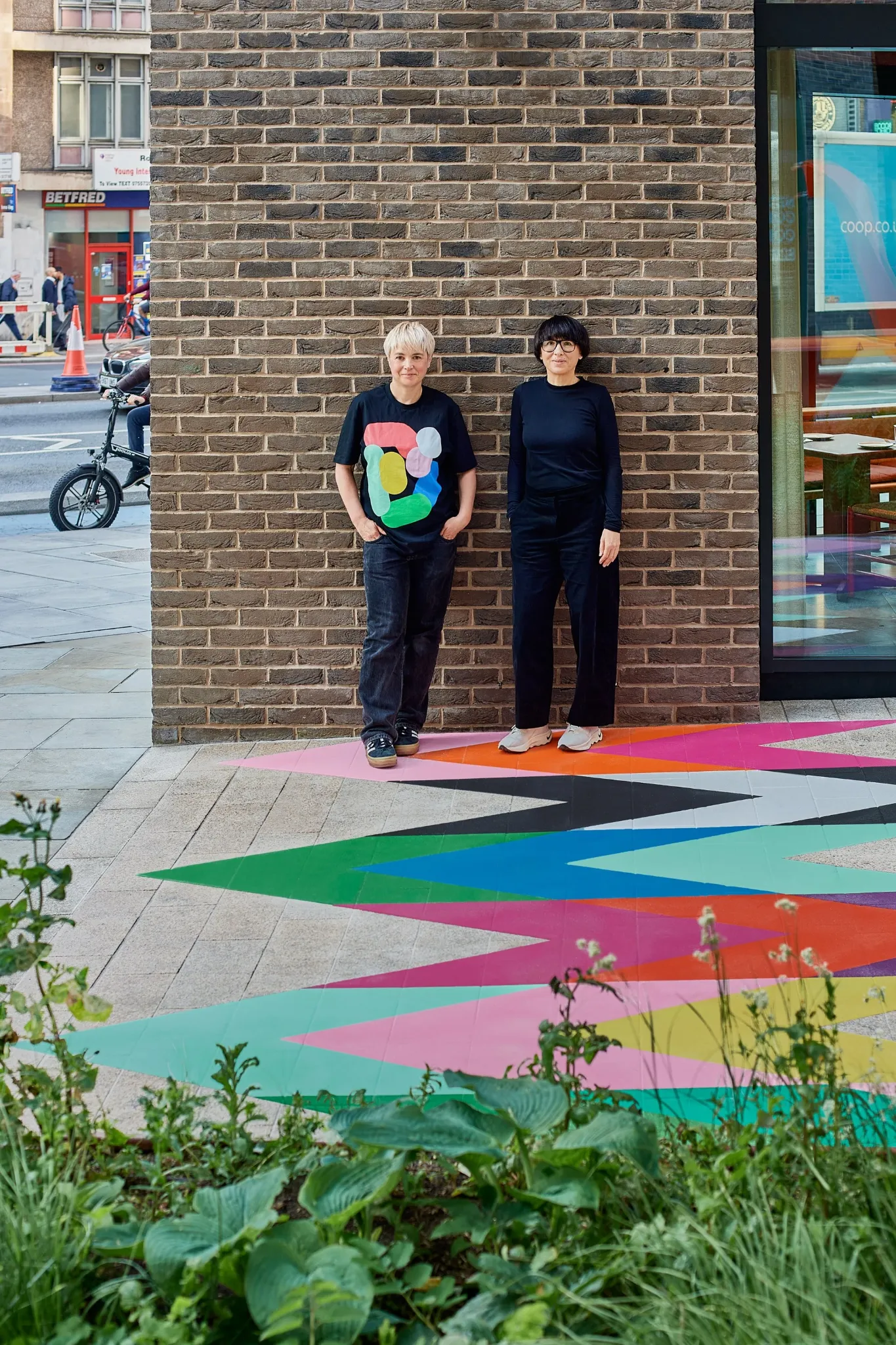
We create colour-led environments that help people navigate and understand places—and make them more memorable.
OUR APPROACH
Differentiate floors, zones and destinations with a palette that belongs to the architecture.
Create recognisable visual markers that can repeat, scale and adapt across different spaces.
Keep essential information clear and legible, while connecting it to the wider visual language.
Give people memorable points of reference at decision points, lift lobbies, entrances and repeated spaces.
NEW BUILD
We work with architects and project teams to make wayfinding part of the spatial concept — not an afterthought.
EXISTING BUILDING
Colour, graphics, forms and landmarks can create a new orientation layer without redesigning the whole building.
SELECTED WORK
Colour, form and wayfinding in practice. Our projects bring together orientation, identity and site-specific artwork across architecture and public space.
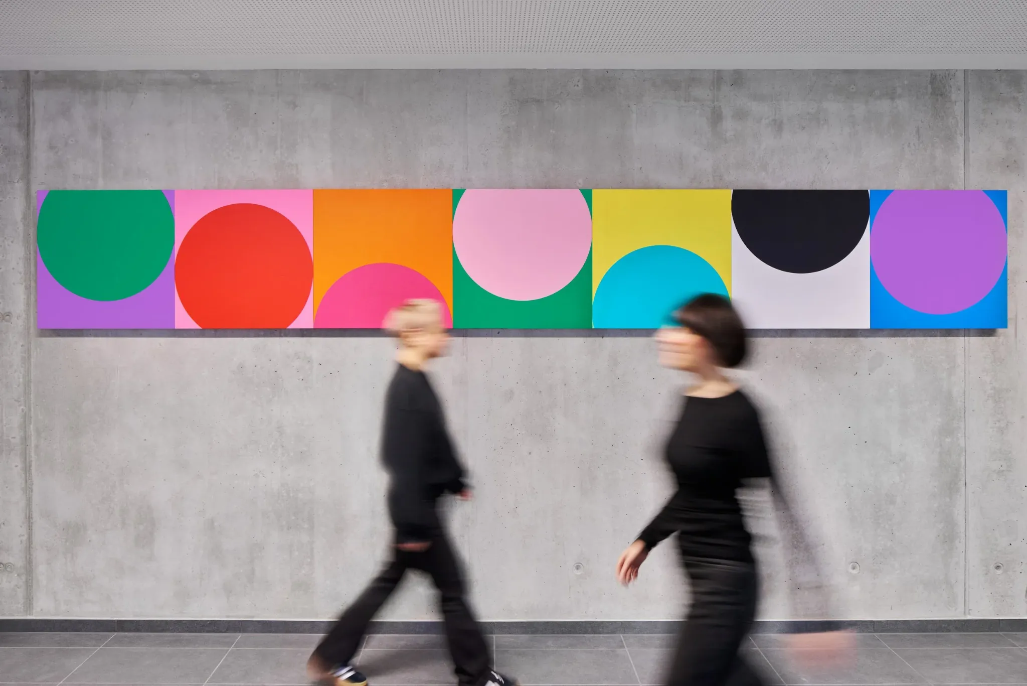
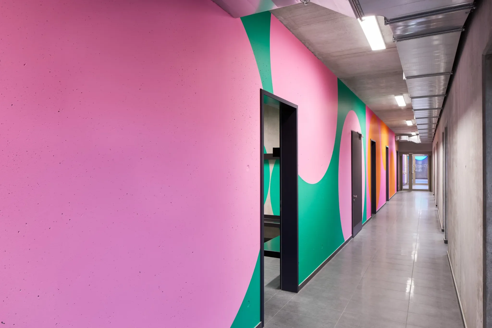
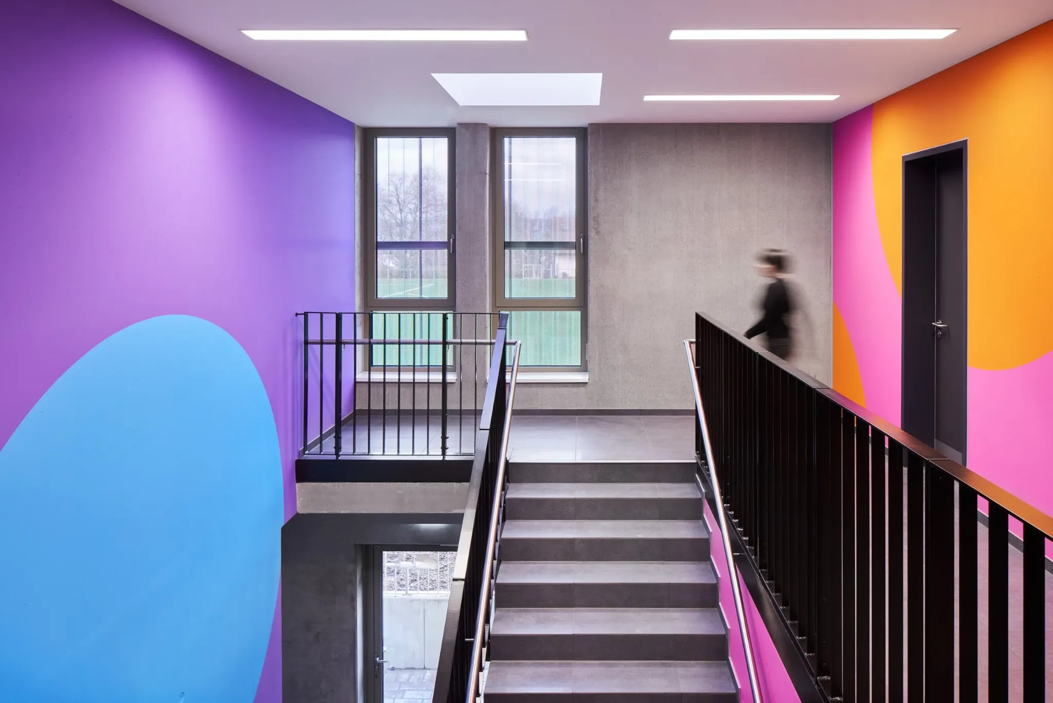
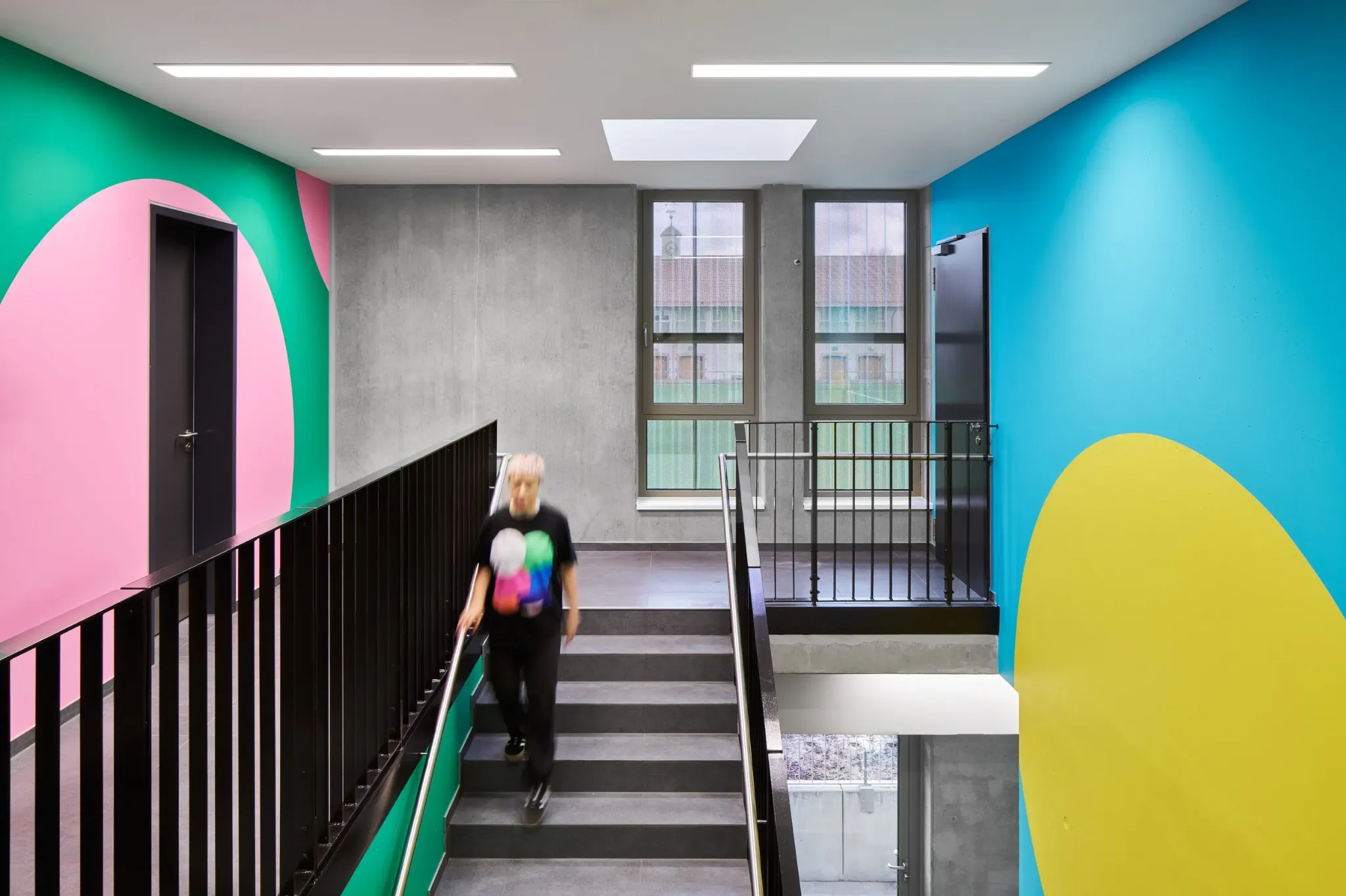
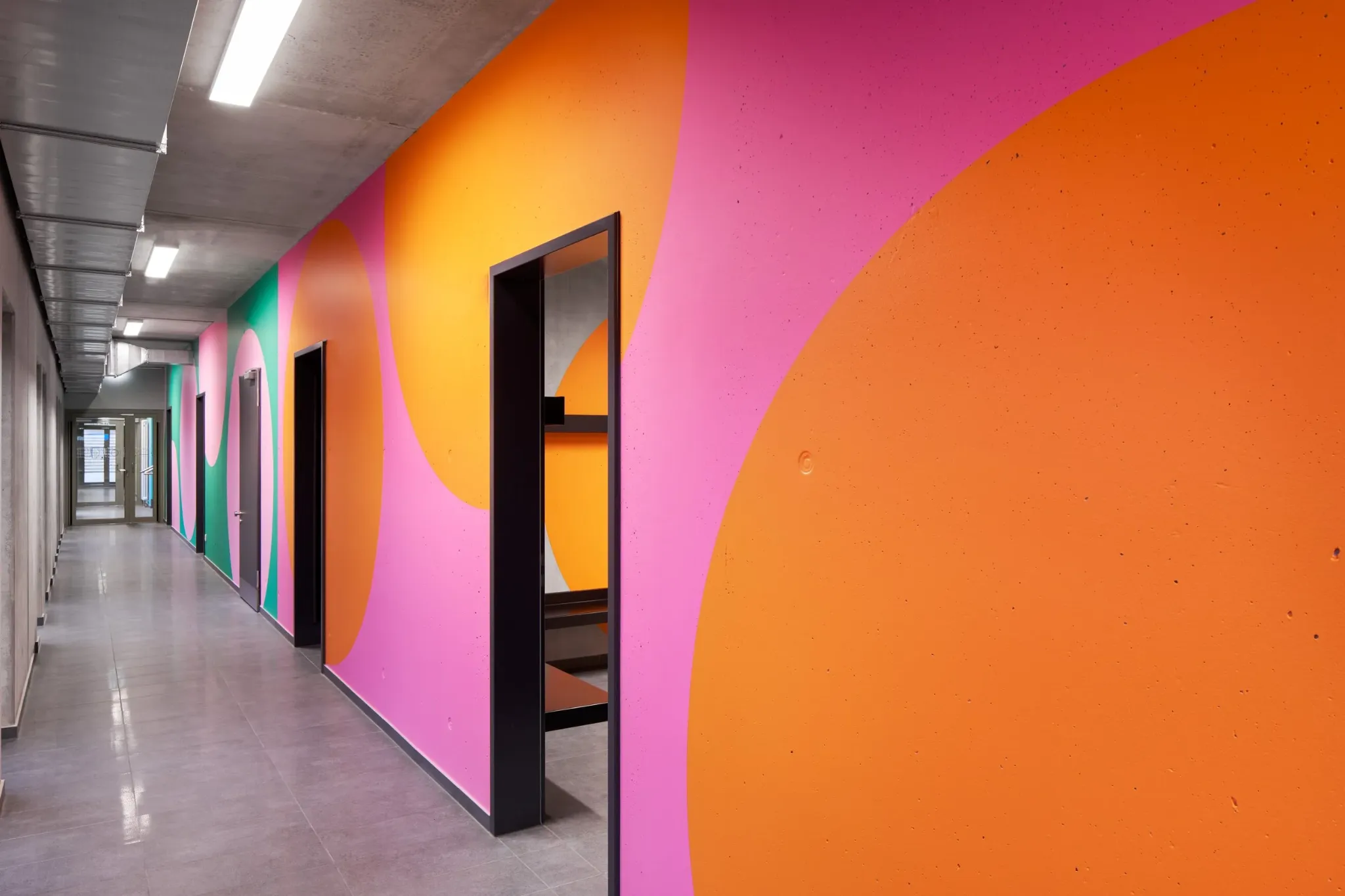


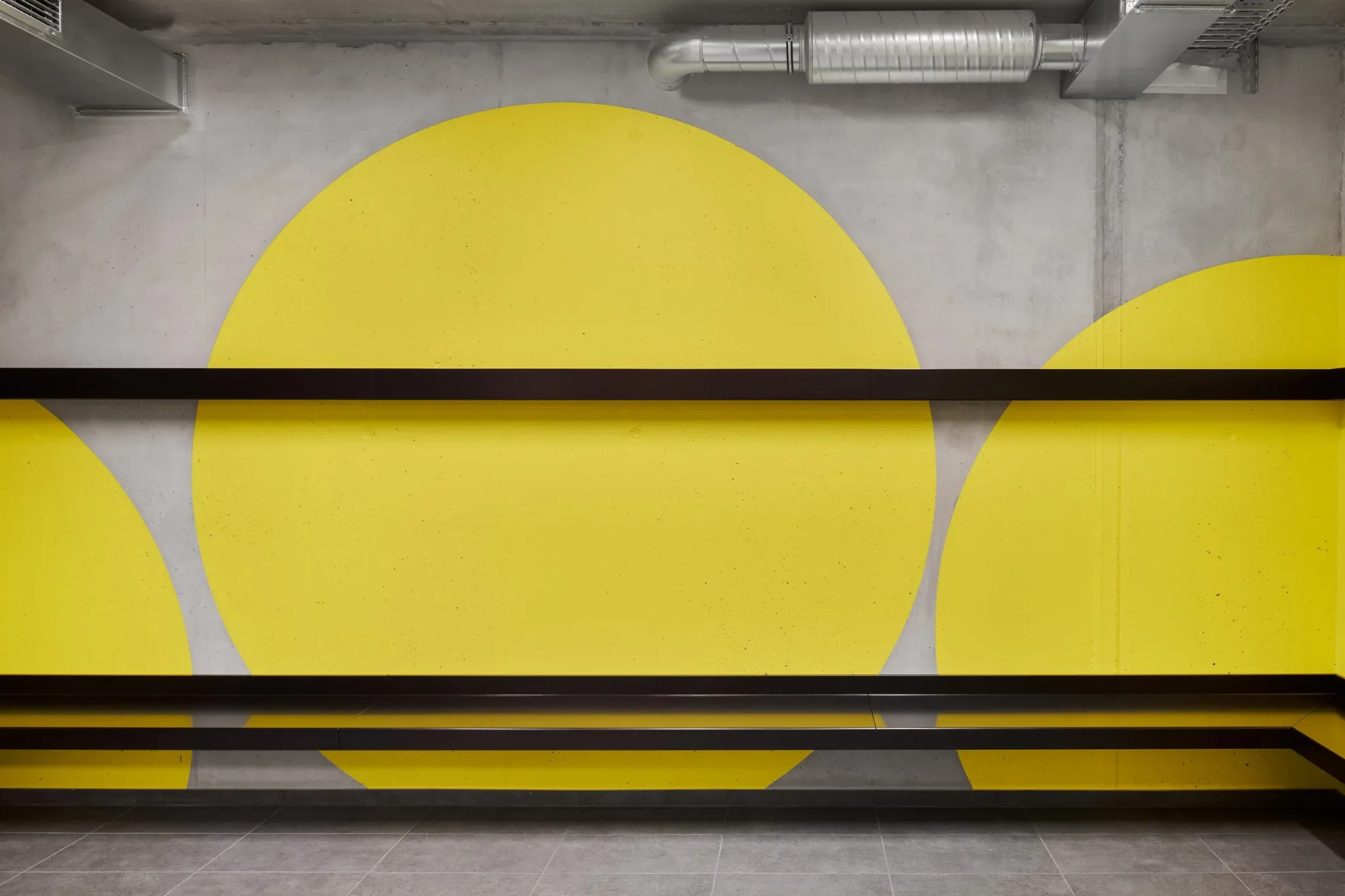
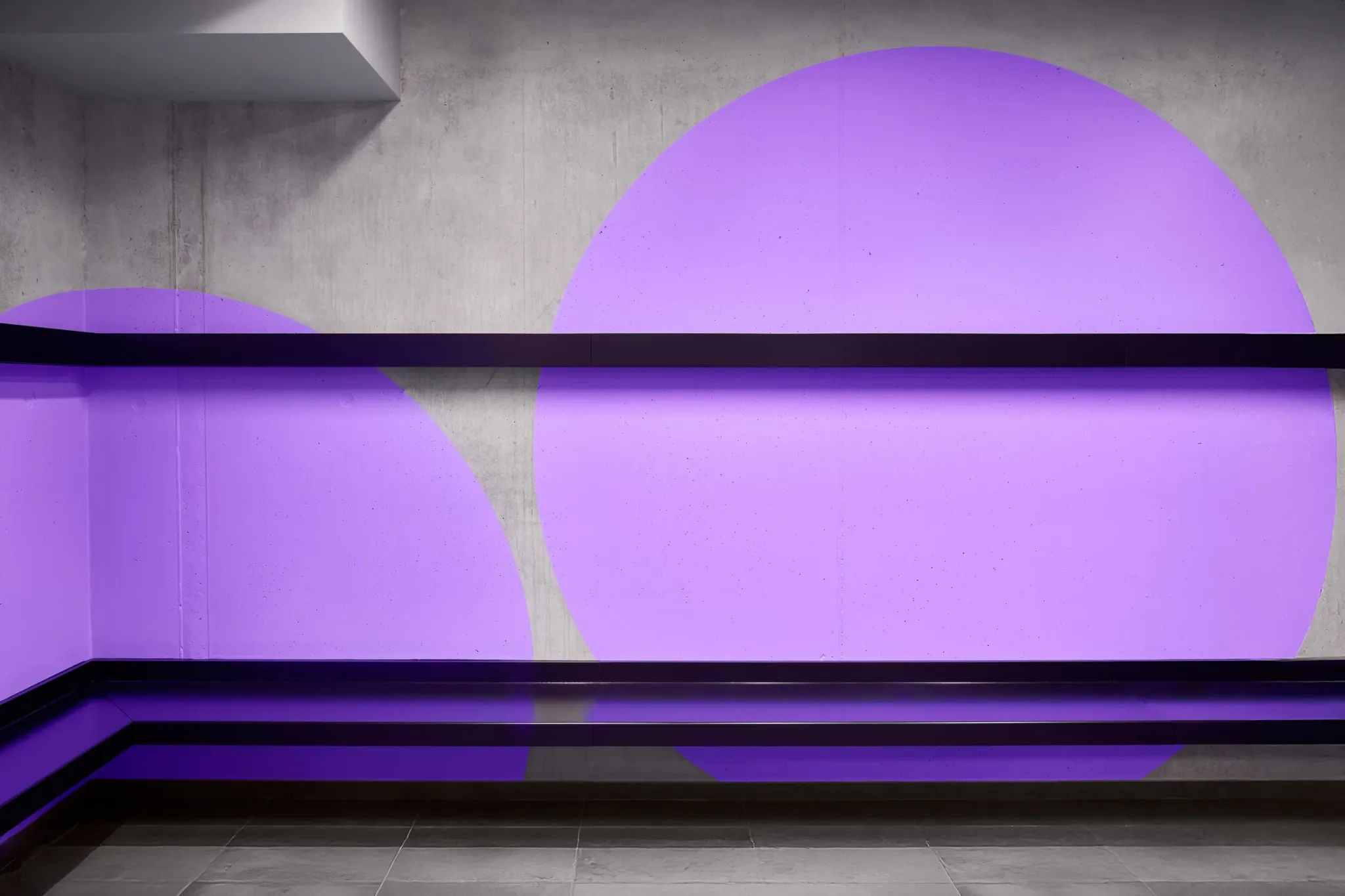
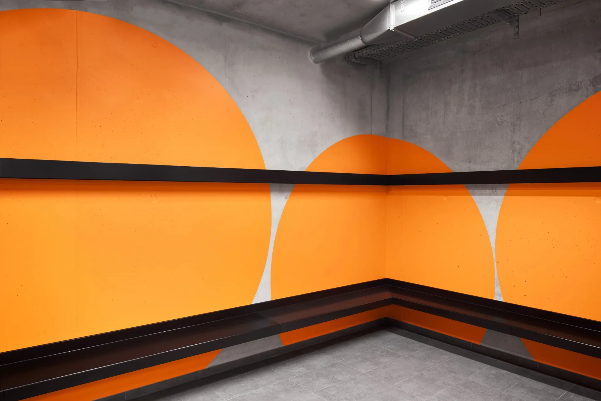
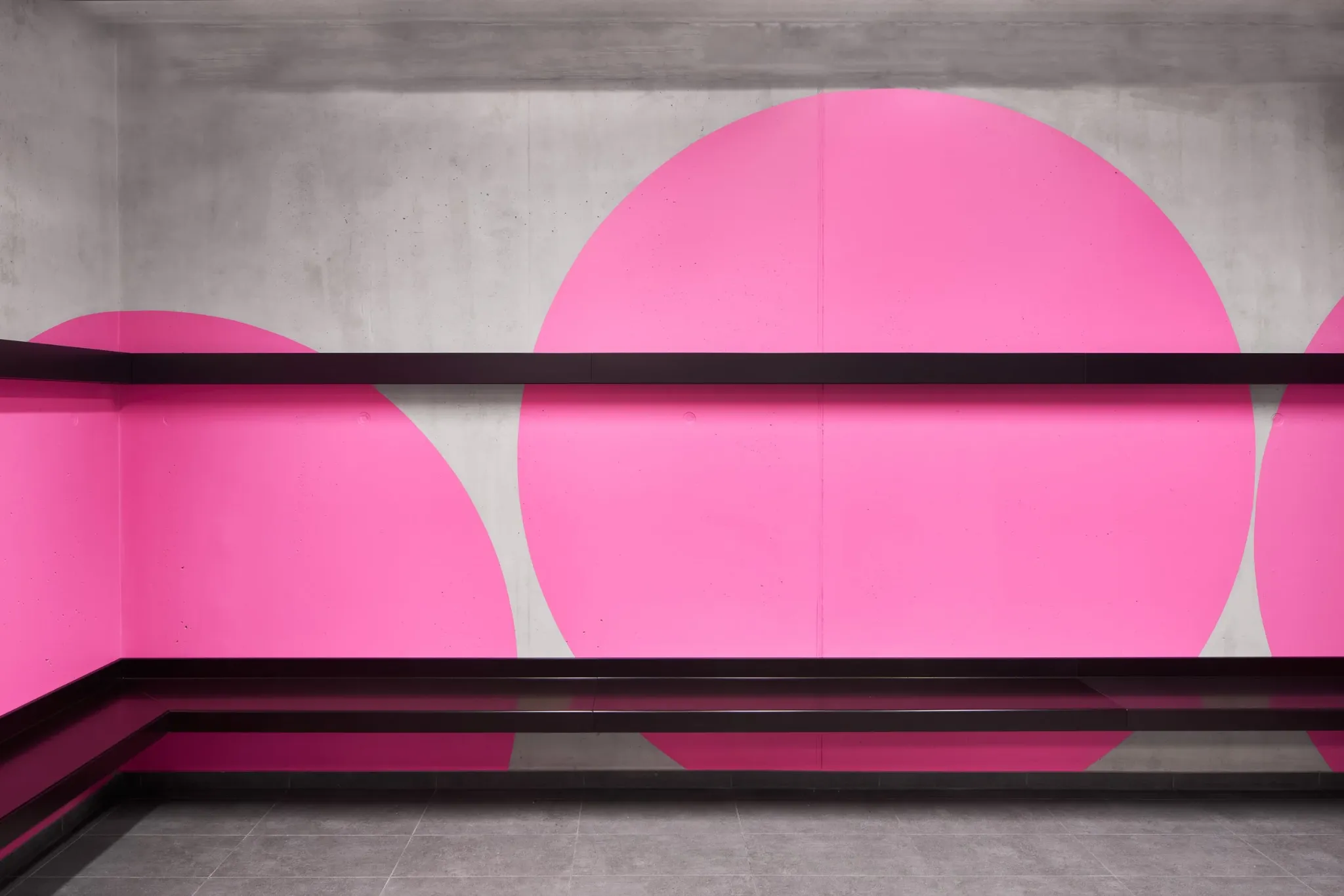
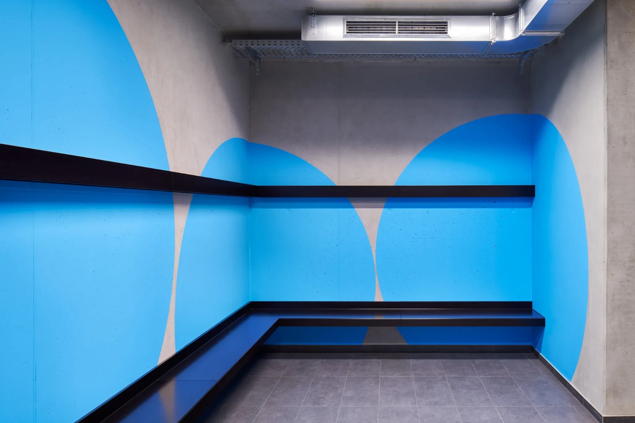
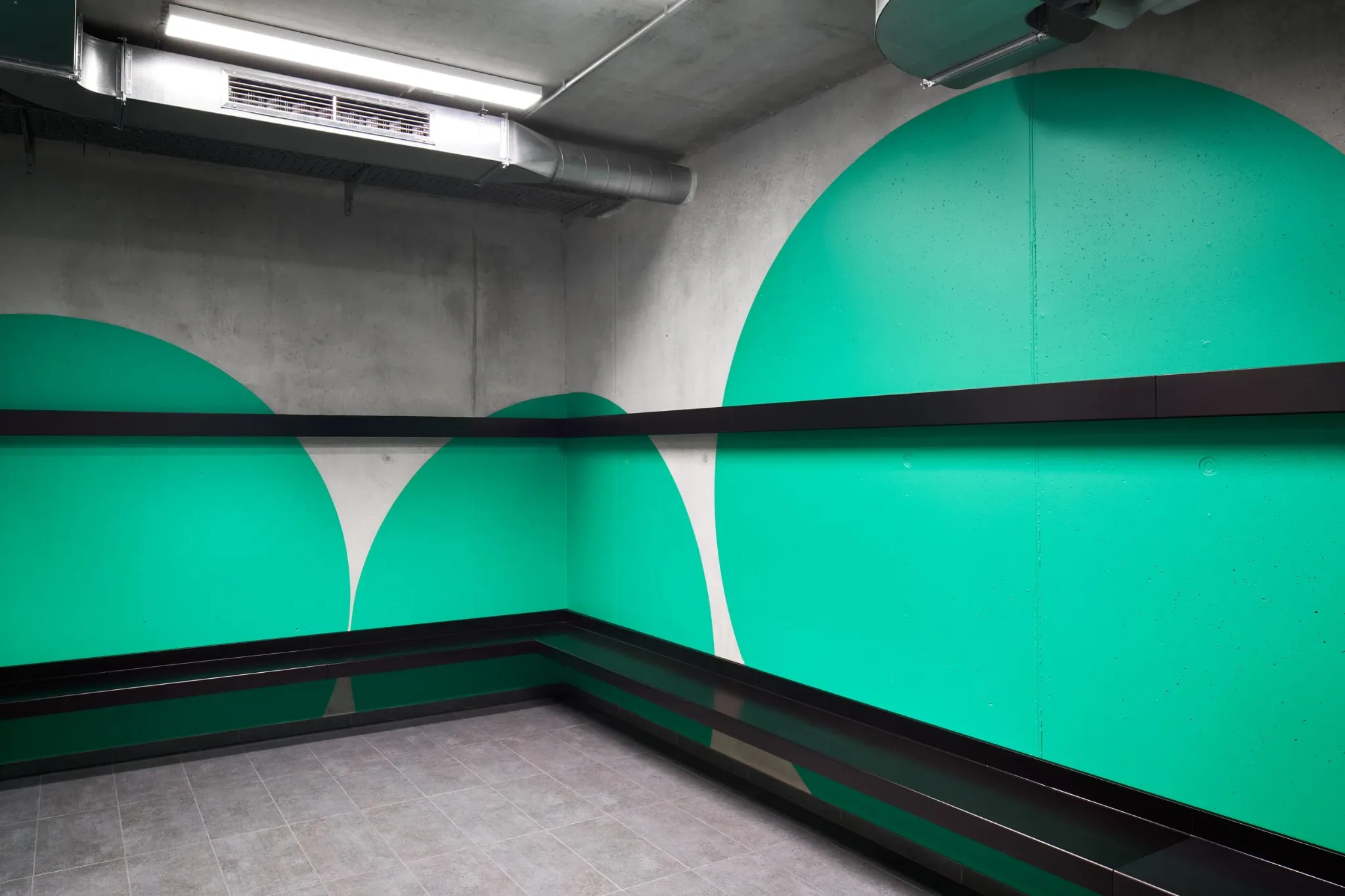
WE PLAY · SPORTS CENTRE · GERMANY
We developed the colour and geometric system for the sports centre, giving repeated spaces distinct identities and helping visitors orient themselves throughout the building.
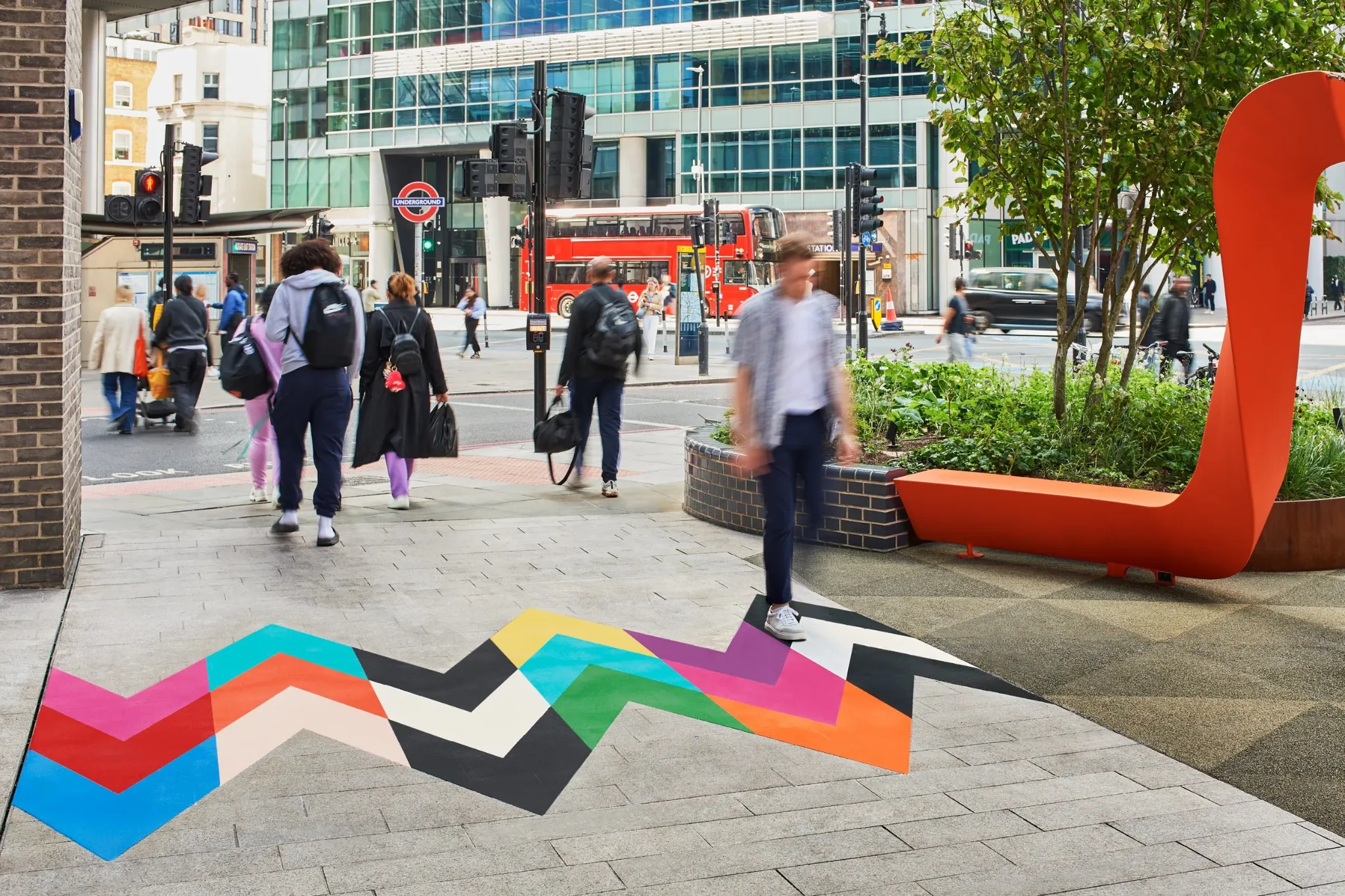
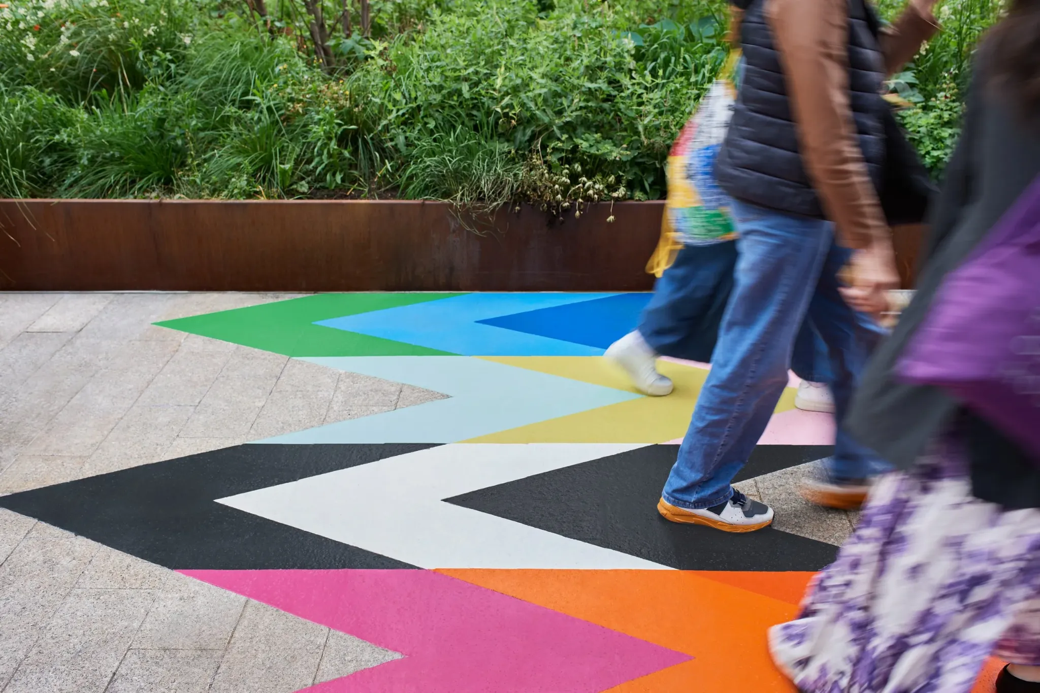
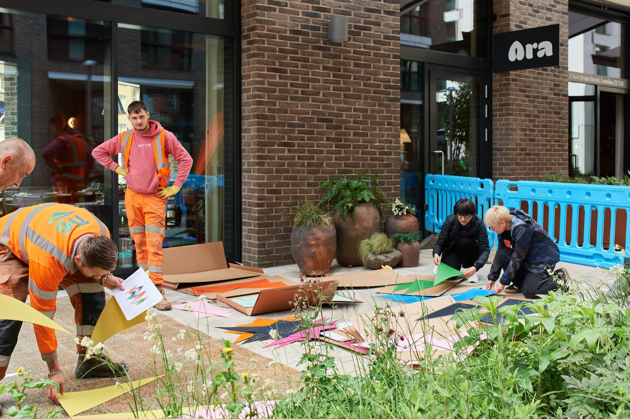


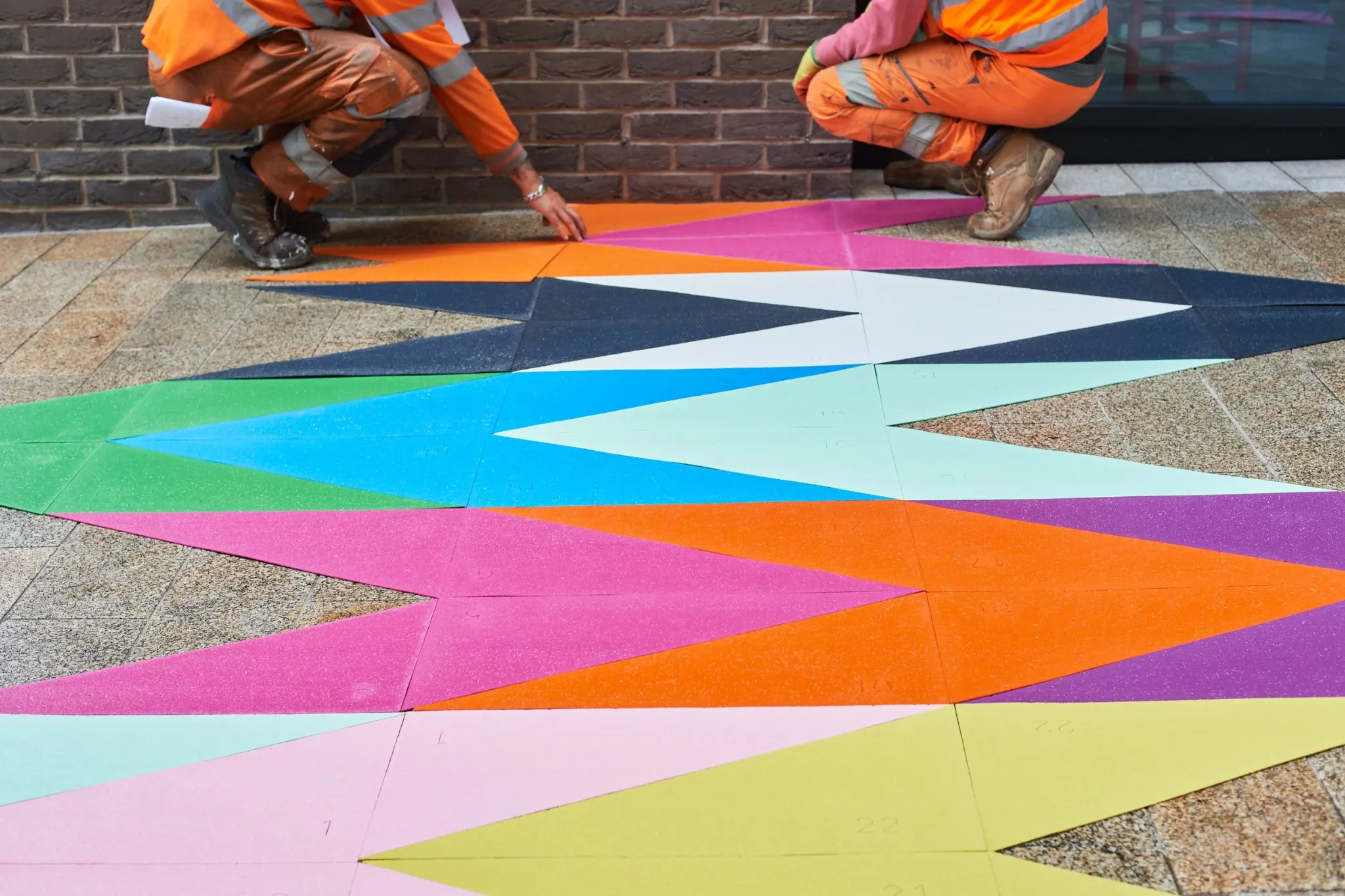
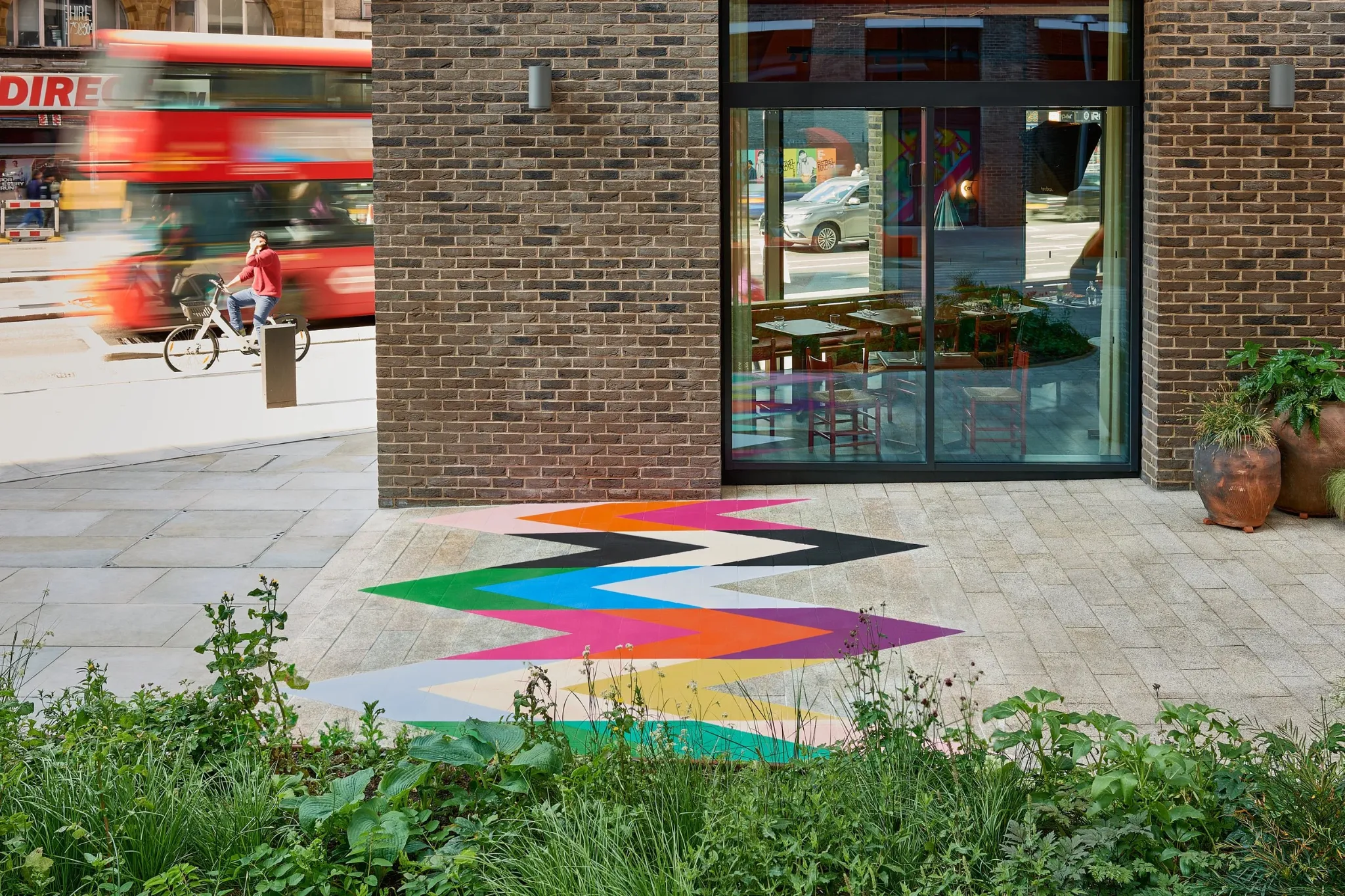


INTERSECTION · PUBLIC REALM · LONDON
We conceived and created this site-specific ground artwork to connect routes through the public garden and draw people into the space through colour, movement and geometric form.
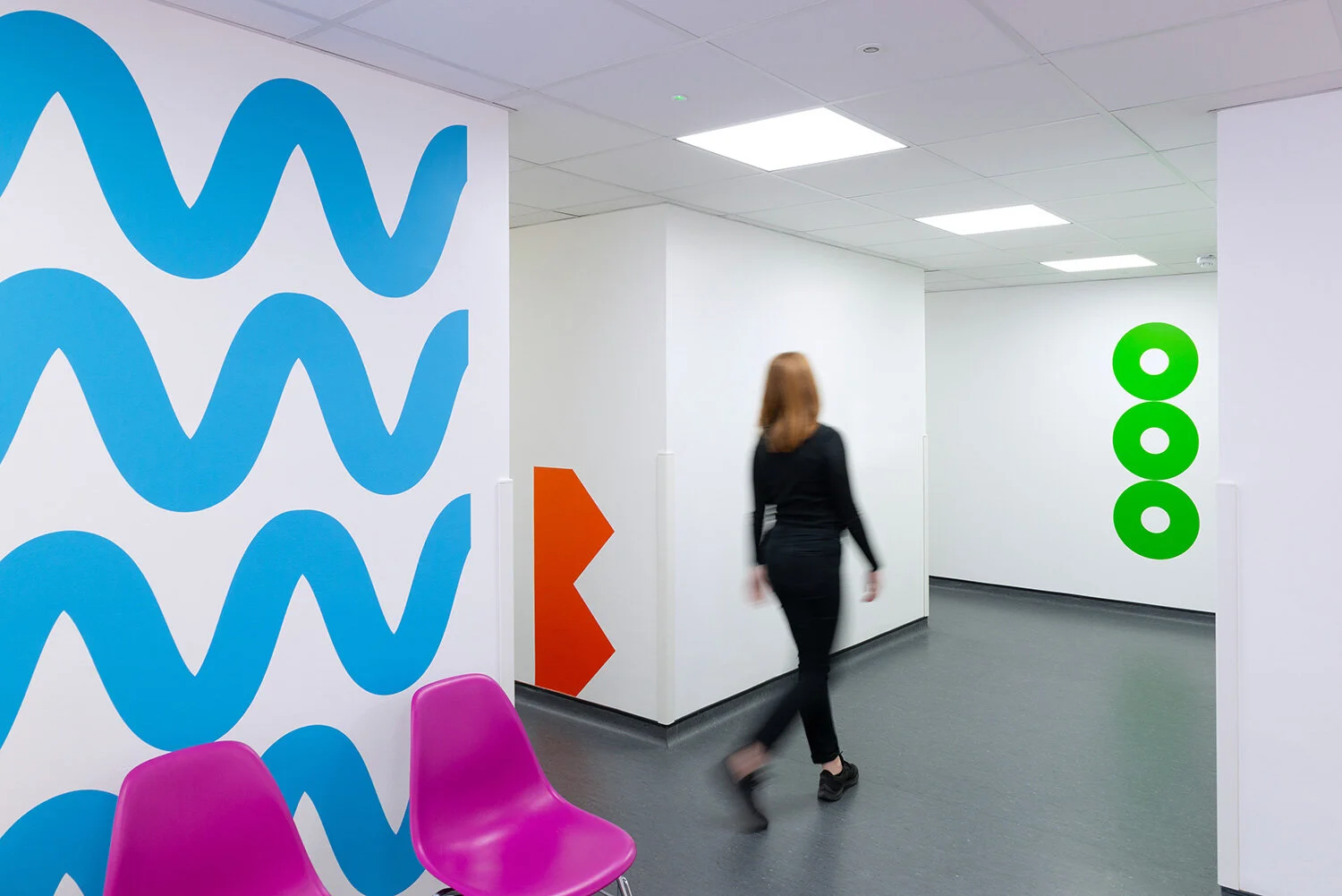
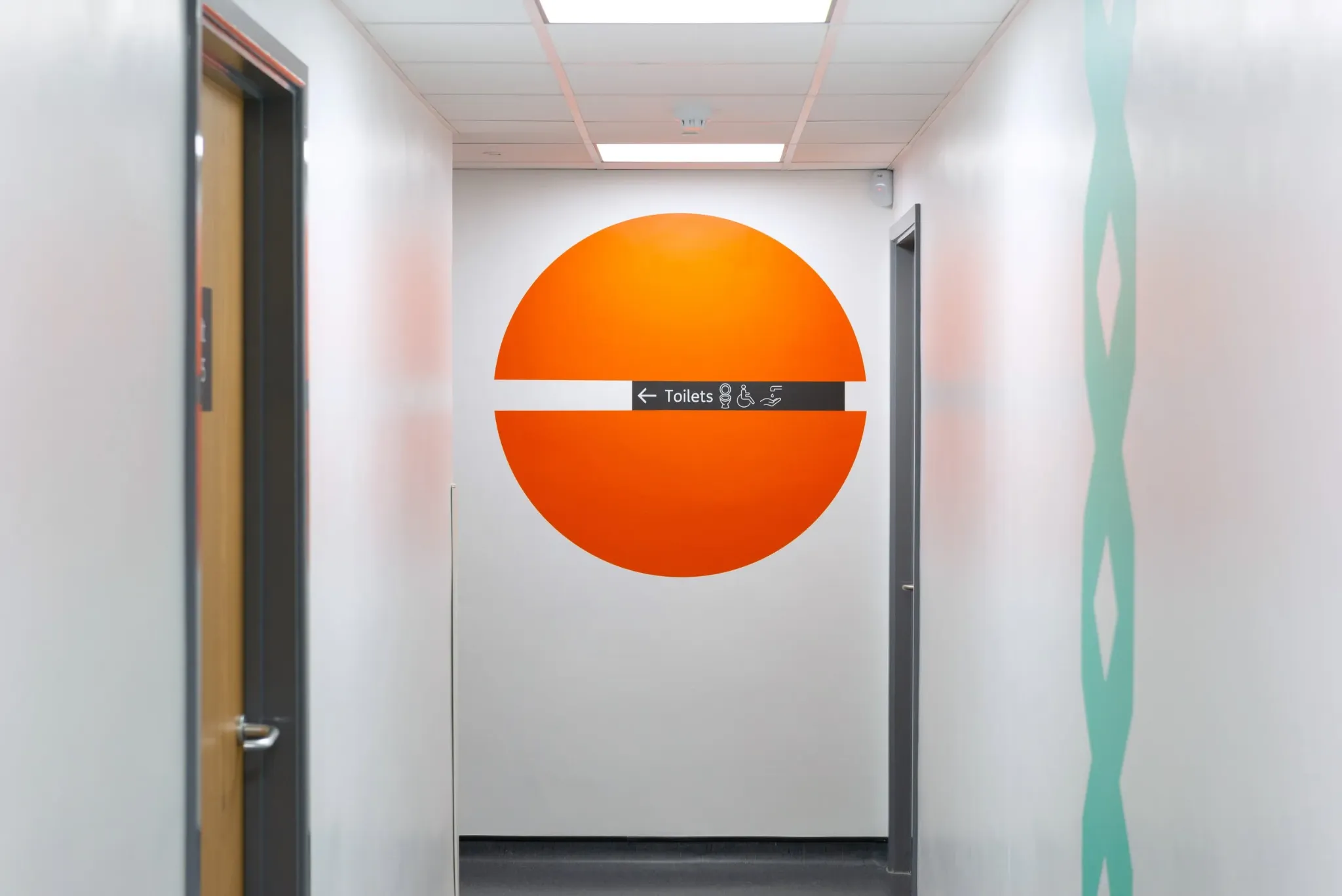
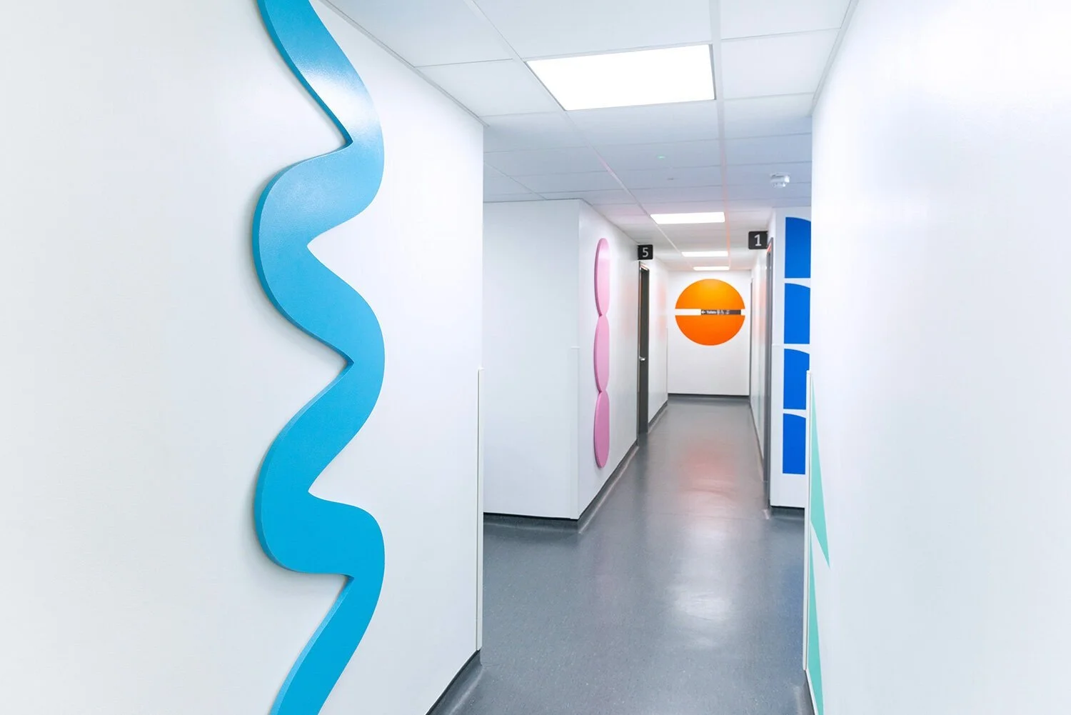
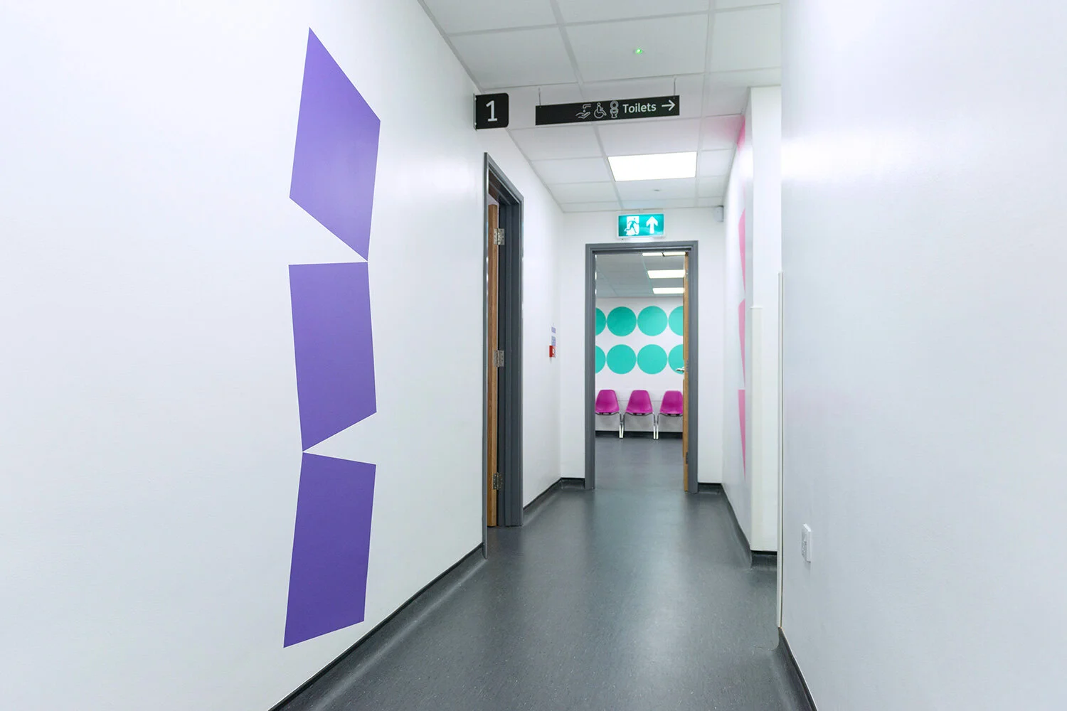
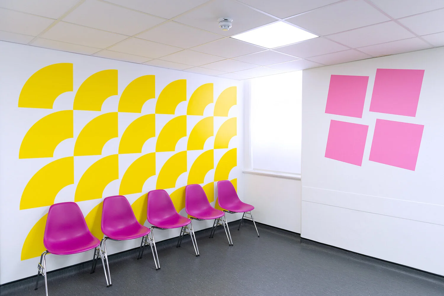
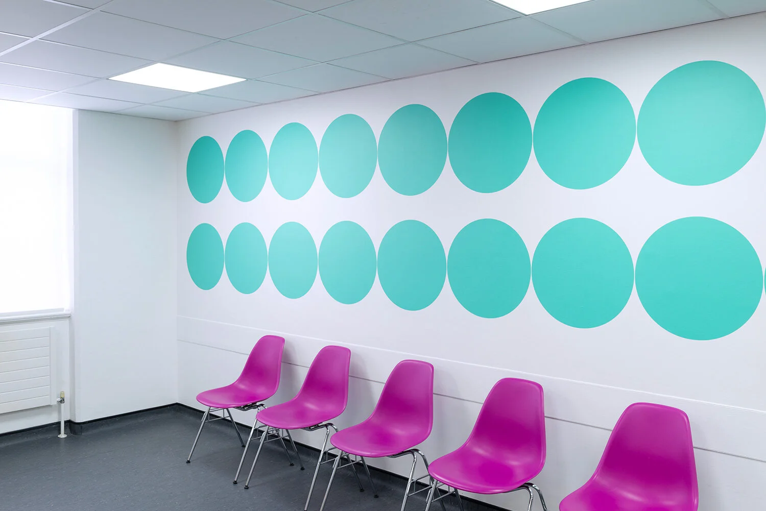
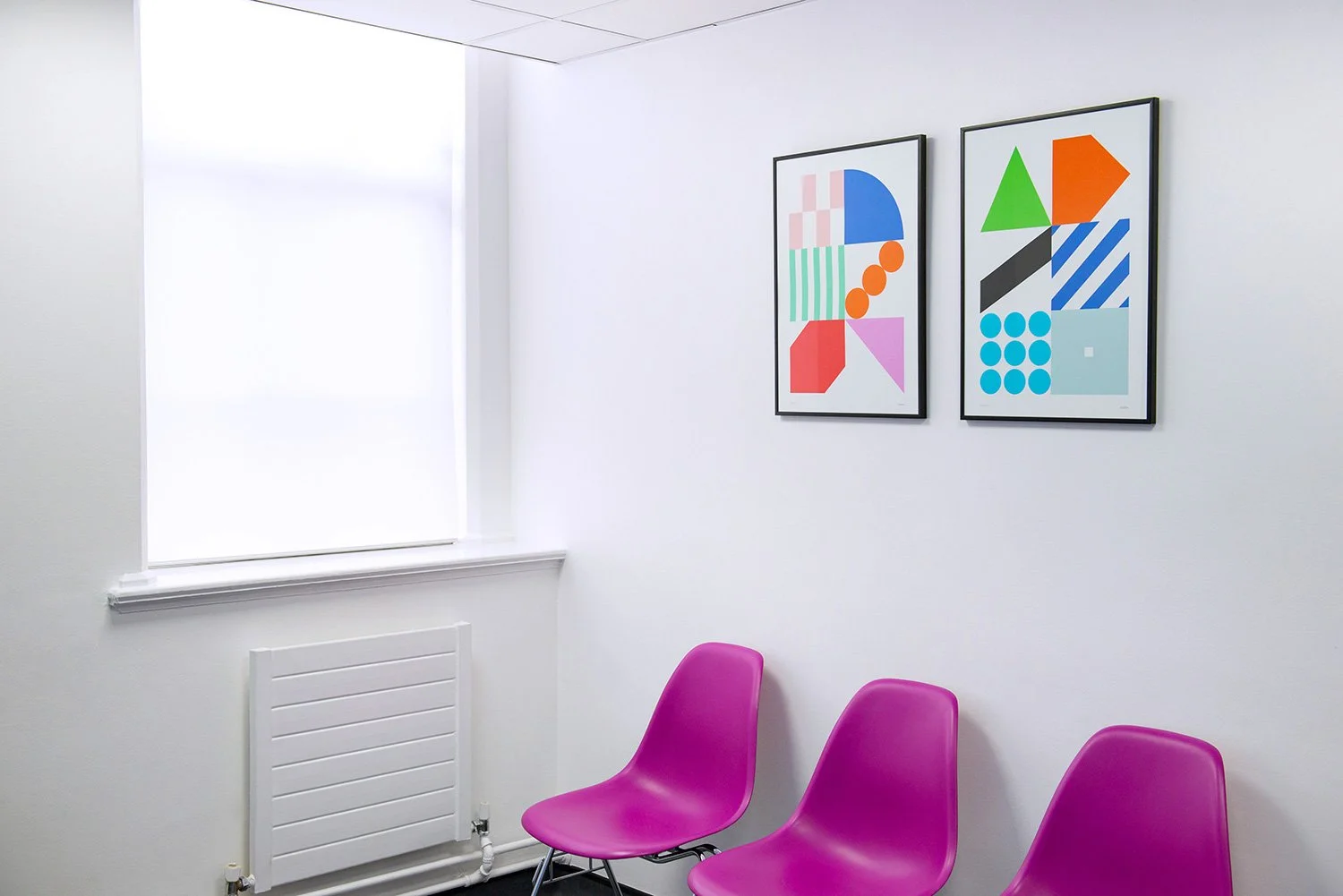
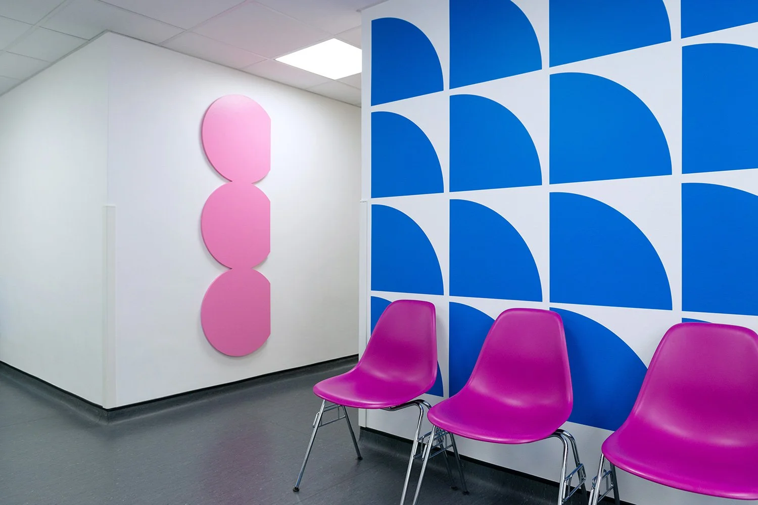
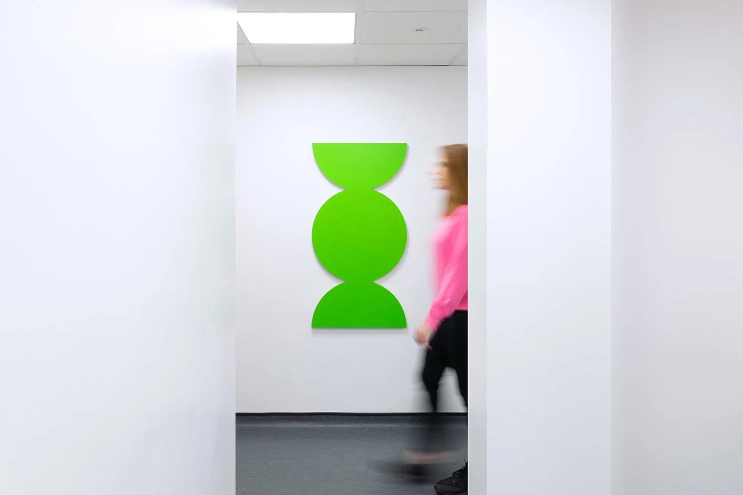
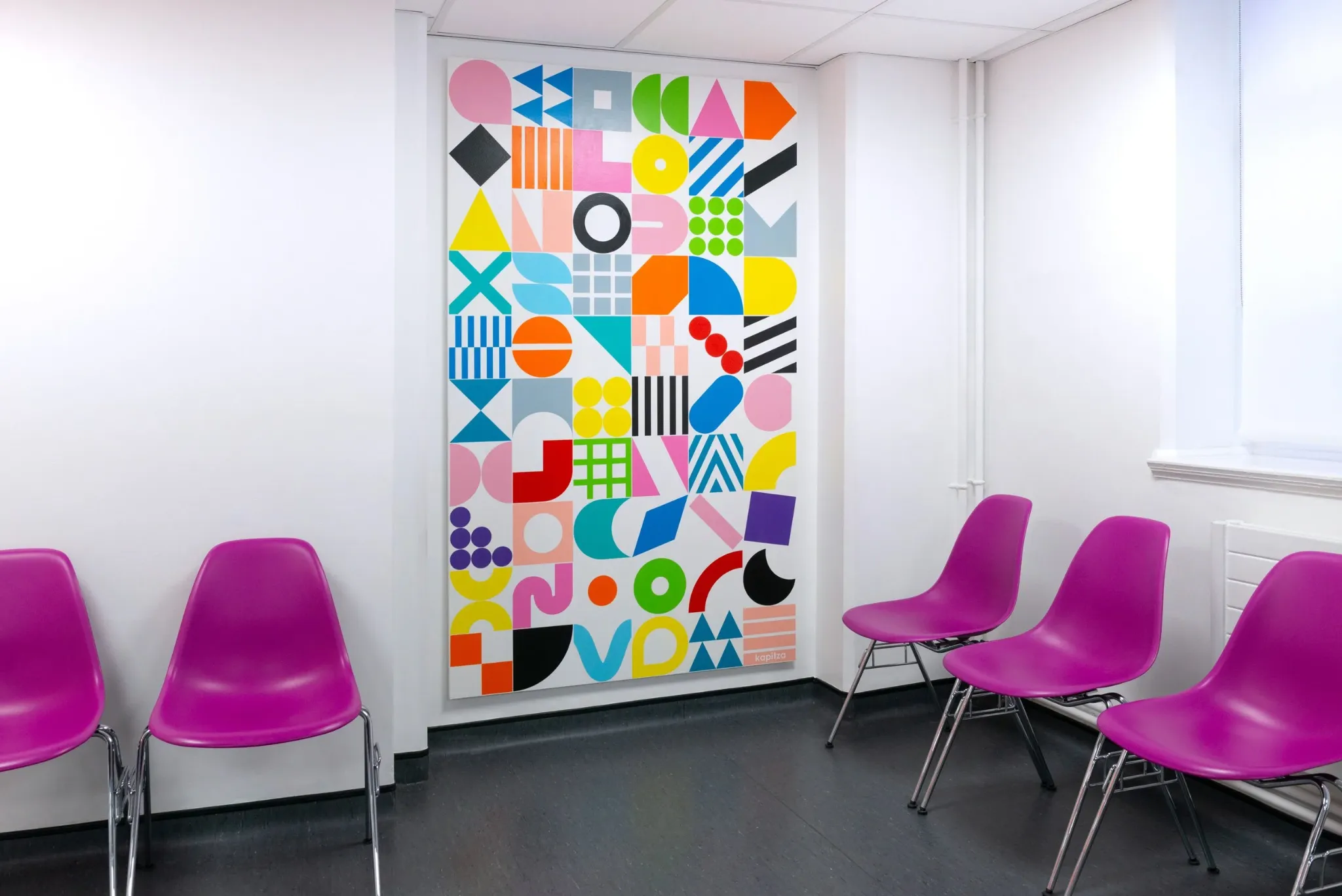
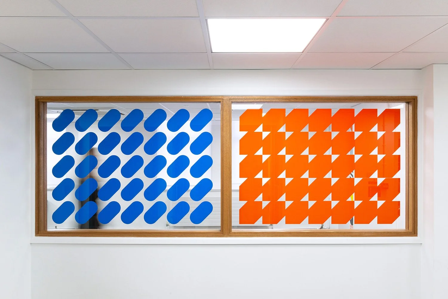
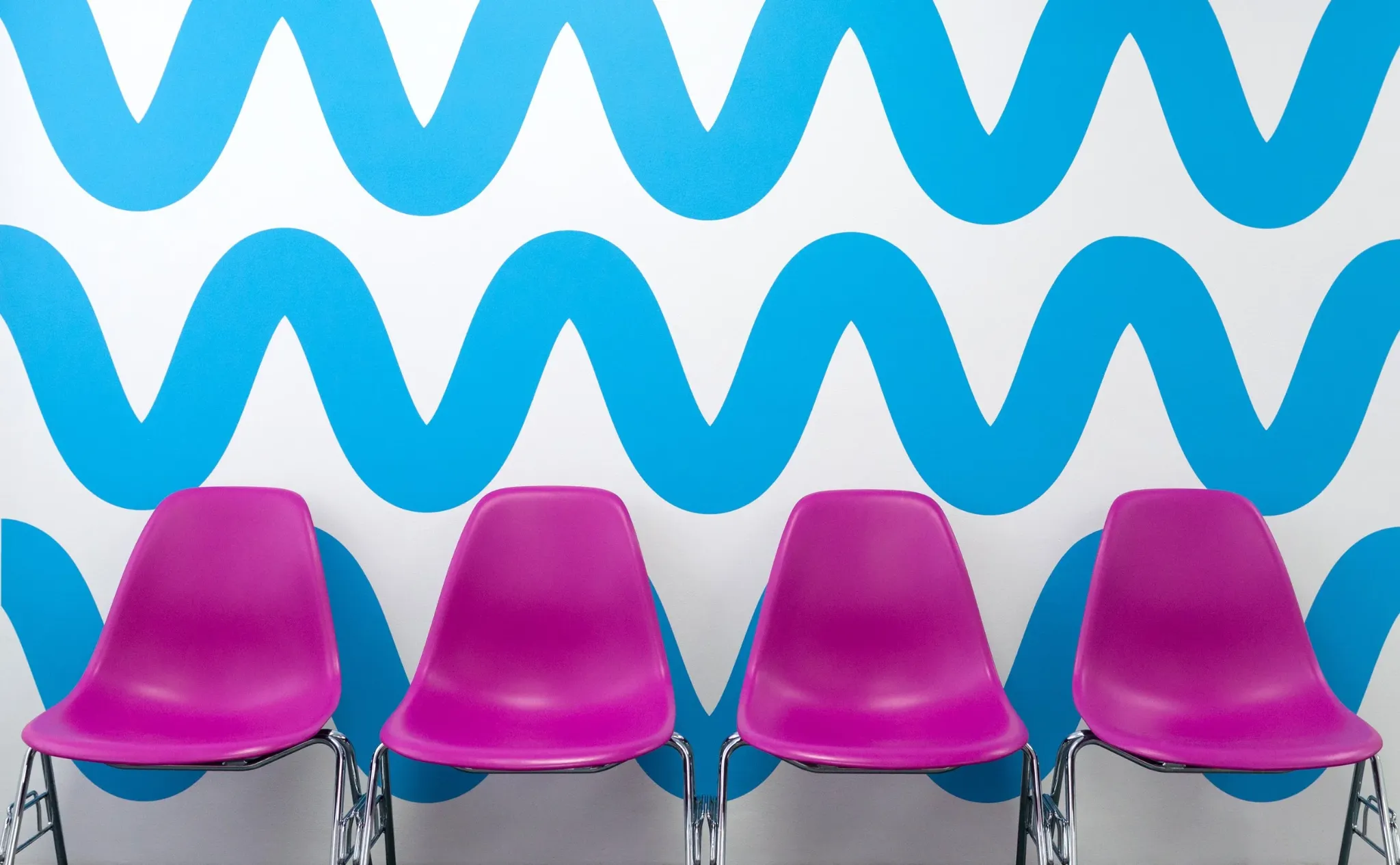
DIVERSITY · ROYAL LONDON HOSPITAL
We designed a family of colour and geometric landmarks across reception, waiting and corridor spaces to create identity, recognition and a more welcoming patient experience.
WHERE IT WORKS
HOW WE WORK
We listen to your team and the people who use the building. Together, we identify what works, what causes confusion and where clearer orientation could improve the experience.
We can adapt an existing colour and form system or create a fully bespoke visual language, depending on your needs, timescale and budget.
We can manage the creative process independently or work alongside your architects, designers, signage team and production partners—supporting your project wherever our expertise is most useful.
WORKING WITH US
“The response from staff and patients has been extremely positive — the work has transformed their experience of the building.”
START A CONVERSATION
If you are planning a new building, refurbishment or public-space project, we would be happy to explore how colour-led wayfinding could contribute.